


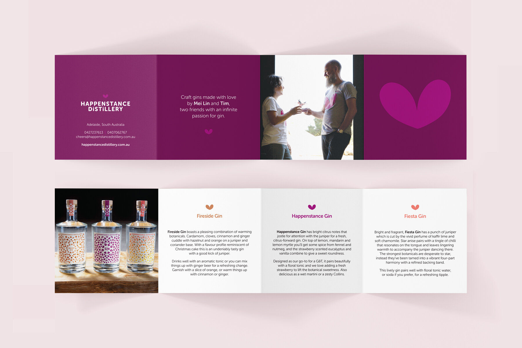


Happenstance Distillery is a South Australian gin distillery, who have a passion for creating gin that will keep you returning time after time.
We worked together to bring their brand identity and signature gin to life. At the heart of the label are the magenta foil berries. This element has subsequently been used on each new gin label within their collection. We worked together to make sure that each gin had its own distinctive personality, but would also sit alongside the original identity.
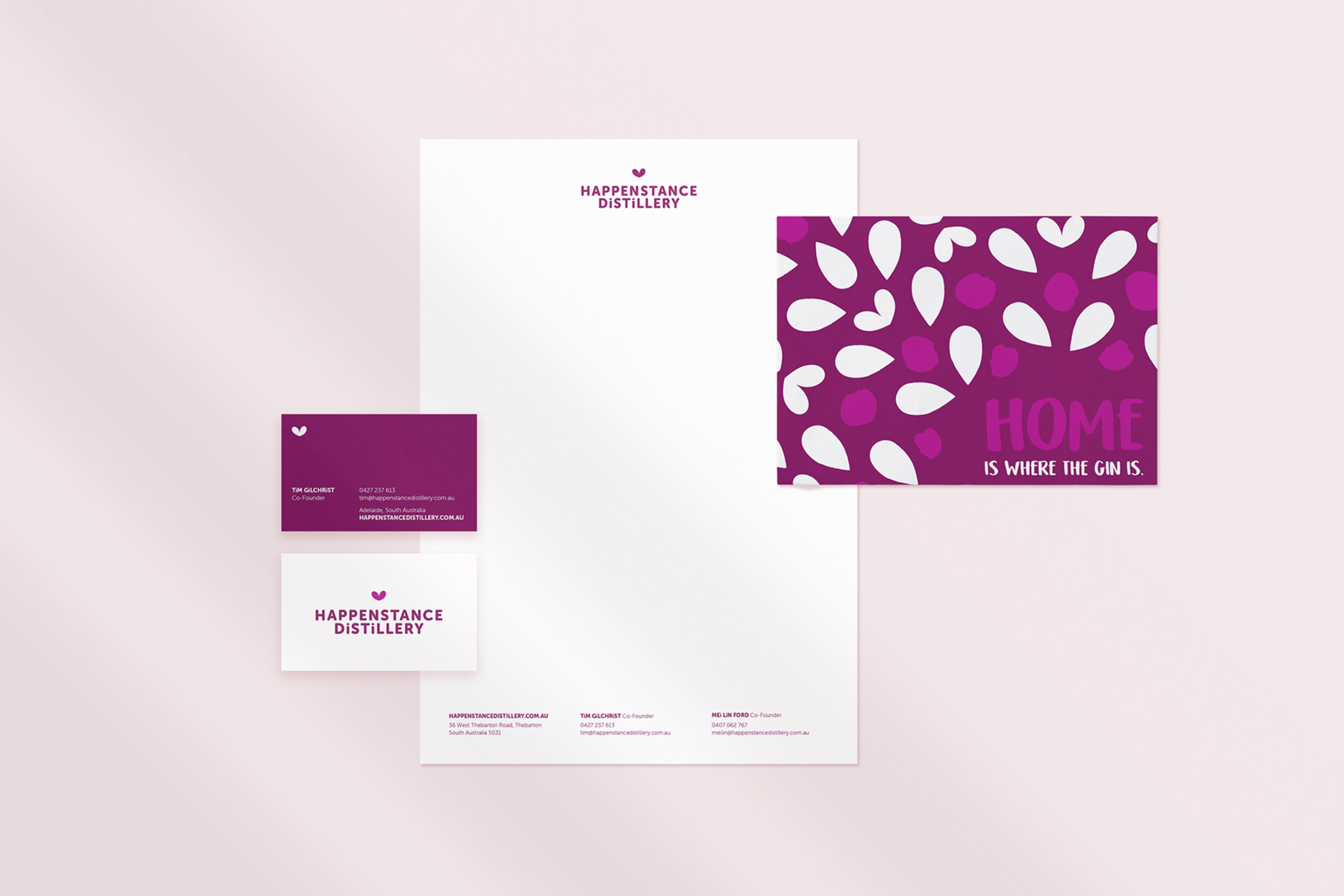
Crafting a Distinctive Brand Identity for Happenstance Distillery
Happenstance Distillery emerged as a passionate South Australian gin maker with a vision to create memorable spirits that invite repeated discovery. Our collaborative design journey transformed their brand identity, establishing a cohesive yet dynamic visual language that celebrates individual gin expressions while maintaining a strong, recognizable core.
The design centerpiece—magenta foil berries—became the signature element that unifies the distillery's growing collection. This strategic visual motif allows each gin label to tell its own unique story while remaining unmistakably part of the Happenstance family. By balancing distinctive personalities with a consistent brand thread, we helped Happenstance Distillery establish a memorable and expandable visual identity that resonates with gin enthusiasts.


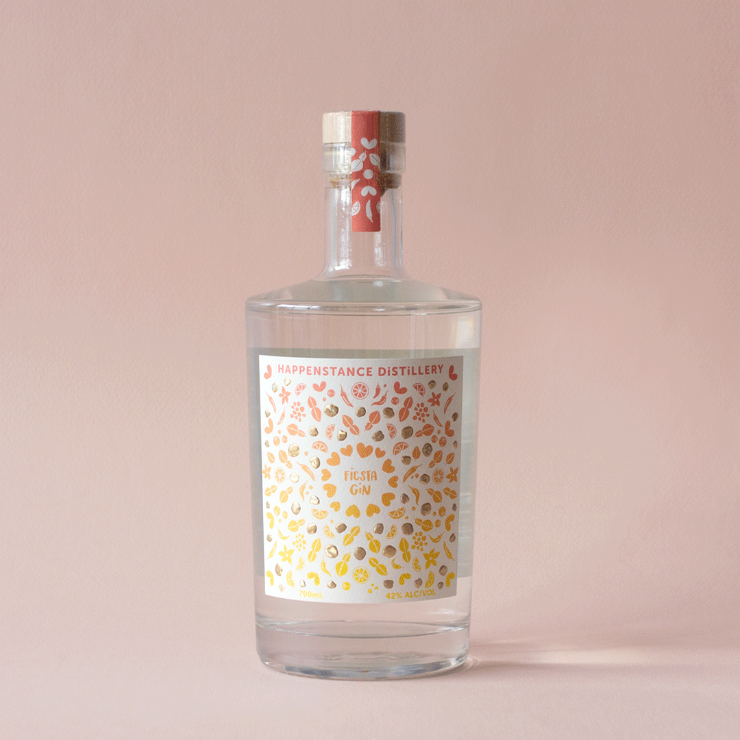
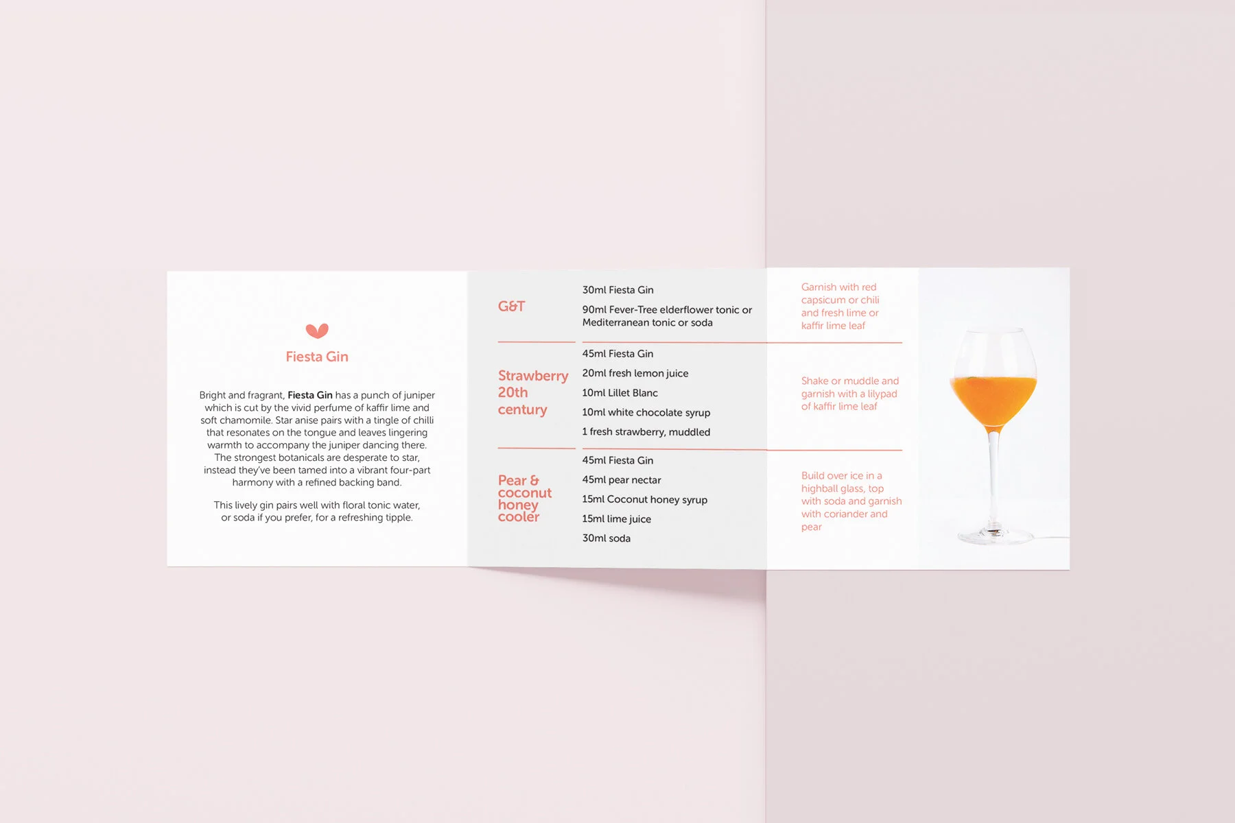


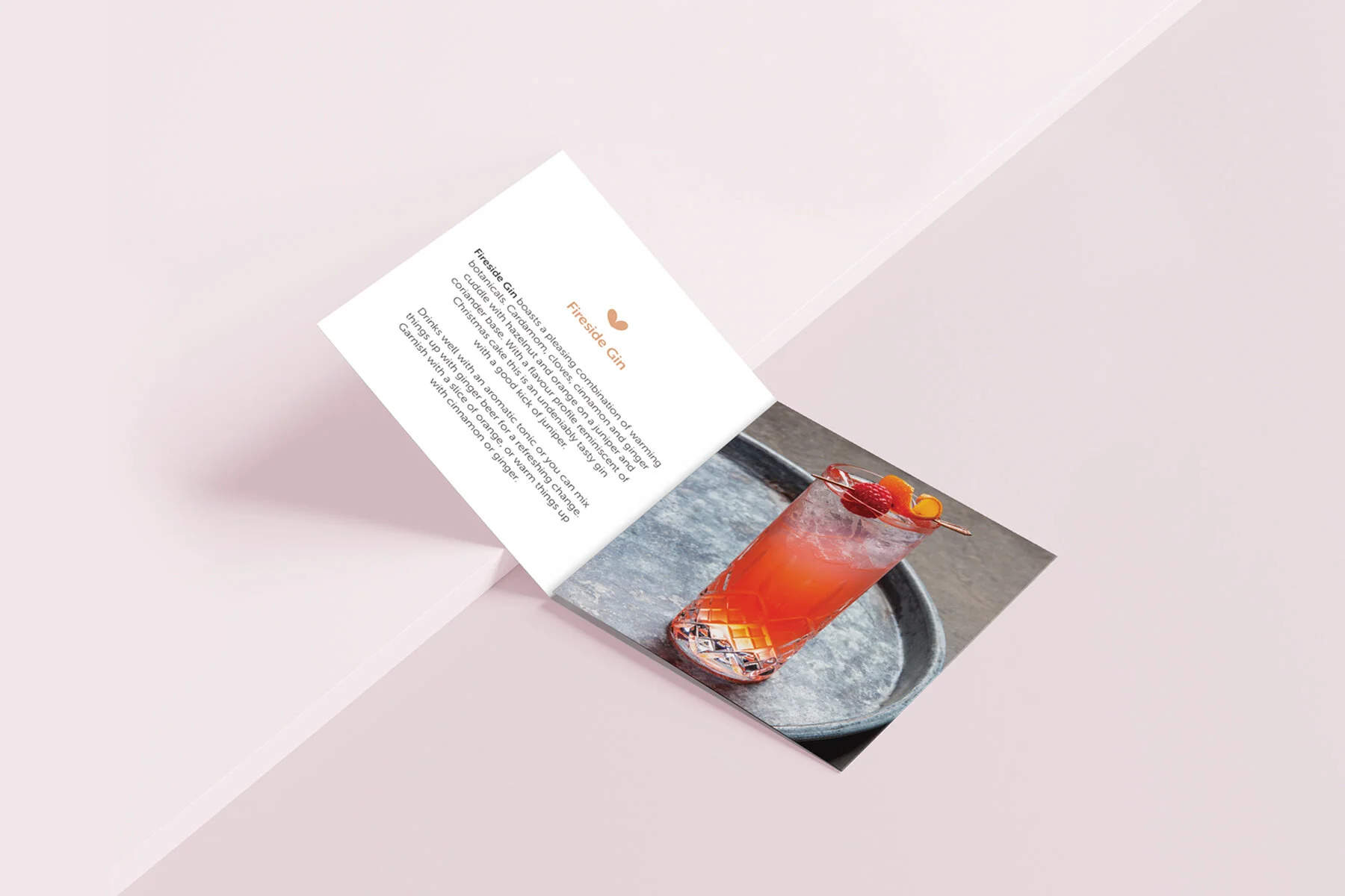
After launching their successful signature gin, Happenstance Distillery expanded their offering to include Fireside Gin and Fiesta Gin. We worked together to make sure that each gin had its own distinctive personality, but would also sit alongside the original identity.